design for craft – commitment to kashmir
This post covers Harpreet’s ongoing craft design workshops as part of the Commitment to Kashmir Project 2017-18. The project is supported by the Commitment to Kashmir Trust, Dastkar, Craft Development Institute Srinagar and Titan Company.

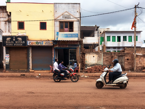
Late September rainy day as we depart for the introductory design workshop at Srinagar, Kashmir. The last time I was at Srinagar was 1981. It has been a privilege to be selected as one of the five designers working on this important project. As a designer, I have a special liking for working in the domain of craft objects. For one, it puts me into a different method and style of working than what I am used to. The people producing the objects become a part of the thinking process and I stop deliberating and planning 100% of the process before the objects start taking shape. People, time and place all hold important positions in design for craft, and I find it best to give them that respect. In the more industrial facet of work, whether in print or products, the work may be reproduced in absolute similarity in different factories by different people at different times (re-editions for example). I realise one cannot work that way in craft.


In the first workshop in September, the project team was hosted at this wonderful cottage called Travellers Inn at Rajbagh, Srinagar. A comfortable environment like this one creates those very essential pockets in the mind that actually process and organise information in a richly informative craft terrain like Kashmir.

Also of help is a Josef Albers inspired doormat at the entrance.


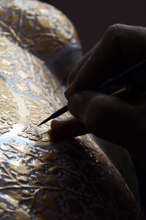
The first workshop in September has been very intensive in terms of gathering sufficient knowledge via observation, enquiry and explorations. Papier maché Sakhta is one of the crafts I am working with and of course my introduction begins with this basket of moist processed paper pulp which is being kneaded together (with rice paste glue) for shaping in a die, mould or simply freehand. Sakhta is a word for the dried, hardened papier maché object that shall then be finished, painted and worked upon by the Naqqash. The Naqqash is the fine artist who is responsible for the finished papier maché object. His or her core skills lie in colour, texture end embellishment.
While the process of generating a papier maché object is simple and easy to understand, it is the details that are worth noticing and hearing about. Of course when a craftsman is directly asked or speaks about details, no information is received – not because the artisan is secretive, but often because the artisan filters them out as unworthy of a flowery presentation. Probably like tourist guides who avoid explaining, for example, sewage treatment in old forts and palaces.
A possible way to develop new objects and beneficial opportunities, I realise, is through identifying the overlooked or underdog details in a process (often, one such detail is enough) and expanding that as a design opportunity. It could be a singular part of the process, an ingredient, a raw material, a practice. Easier said, though.


These are most of the tools of the Papier Maché Sakhta maker (upper picture). From left to right, they are used to help shape the object at different stages of hardness. On the extreme left, when it is still wet and not yet put out to dry. In the middle, when it is semi-dry though can still be smoothened. On the right, when it is completely dry. I missed out a wood saw in the last picture.
In the lower picture, rows of papier maché easter eggs drying at the workshop mezzanine.

One of the team decisions has been to consider the papier maché product of Kashmir as a result of two processes – the Sakhta-making and the Naqqashi. The idea is to then develop objects exclusive to each process. While this does not affect the Naqqash (the papier maché surface painter) much, it directly affects the Sakhta artisan, who is not used to developing a finished product in his workshop. However, when viewed in positive light, this is a great growth opportunity for the Sakhta artisan. Provided the design process and objects developed do justice, of course.
My approach has been to work upon the colour of the paper pulp itself as a visual design feature. In the usual work model where the Sakhta maker produces a raw papier maché object for the Naqqash to finish, the colour of the paper pulp does not hold much importance since it is painted upon by the Naqqash. However, given that the Sakhta itself shall now be a finished product, colour, quality and finish suddenly return to focus. It is with this in mind that I chose to experiment with colouring the paper pulp. From trying various additives like fountain pen ink, tea (boiled and unboiled), plaster of paris, cement, turmeric and charcoal (see swatch pictures above) – I have narrowed to turmeric and charcoal. The reasons are easy availability, natural sources, colour contrast between the two and the capability to produce a third colour when mixed.


The upper picture shows turmeric, charcoal and pulp being mixed together. The next picture is the result – a rich olive green pulp ready to be shaped into an object. The result of mixing shall of course vary slightly each time depending on the colour tone of the raw paper used to make the pulp. In this case, the pulp was bluish. Green is a natural result. This is only one of the possibilities.

As a hidden intervention, and one which came about quite accidentally, I realised the benefit of using kitchen cling film onto wooden/terracotta mould before they are dabbed with pulp to take shape. Cling film substitutes newspaper (which is used extensively as a separating layer between the mould and the pulp) and produces neat inner surfaces of objects like boxes, containers and trays. This reduces time and effort required to peel or scrub off the newspaper – which leaves the surface full of scratches. While some may point to the use of plastic, I see no harm in benefiting from its advanced properties, where essential.


My list does not include the copper forming artisans but whoever loses the opportunity to visit the workshops. The government restriction on the usage of machined processes results in a nice hand feel to each object.


Another workshop I am working with is that of a sole entrepreneur, Javaid, who produces bags and accessories for the local Srinagar market utilising the vibrant signature crewel embroidery one can so easily associate to Kashmir. The idea is to help with new designs with which he may approach new markets across the subcontinent, especially in the urban centres of Delhi, Mumbai and Bengaluru.

Javaid drives me to the Khaka workshop, which in simple terms is a tracing repro-shop. In the picture above, note the pinned holes in the tracing sheet. Embroiderers from the locality come to the workshop with their desired print-patterns and fabric. The Khaka workshop repeat prints the tracing onto the fabric by transferring either a black or white solution through the pinned holes onto the fabric. That makes it faster and easier for the embroiderers to mass produce a single pattern. They can of course choose to play around with the thread colours.

Speaking of colours, here is the thread stock at the crewel embroiderer’s workshop. I like his attempt at segregating colours by their visual temperatures.
As an approach to help Javaid, the plan is to introduce him to lesser and subtle uses of colour in embroidery applied onto bags and accessories that are relevant in their look and functionality to India’s urban consumers. I believe the modern craft product user (or collector as is often the case with craft products) of Indian cities is sensitive to two kinds of aesthetic approach. One, where the product retains its strong visual or functional traditional values, often leading to technically elaborate ‘editions’ and the other where it does so yet in a more discreet, affordable and everyday sort of way. It is the latter I am planning to position these new products to.

On one of the evenings, Dr Jyoti Singh, grand-daughter of Hari Singh (the last Maharaja of Kashmir) has been kind enough to invite the team over for high tea at her Almond Villa. I have been told Dr Singh is the founder of the yearly Dara Shikoh Festival of Arts. I gather from our conversation that she is a passionate supporter of the crafts of Kashmir. The Almond Villa is a great location – mountain range rising from the back lawns and a low-tourist segment of Dal Lake up front.

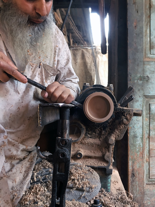
Back to work and another craft – this time the walnut wood carvers of Kashmir. The workshop in the pictures above produces large turned wood bowls and containers from local walnut wood. The carving is outsourced. Sadly in the time between the two workshops of September and December, the wood carver whose work can be seen in the upper picture has passed away. It is as I mentioned earlier, each artisan is a living fragment of the craft. This loss cannot be substituted in any manner.


I also make a visit to a larger wood workshop – one where larger machines and more workers allow for larger pieces to be produced quickly. This is craft too. The definitions shall always be blurry.
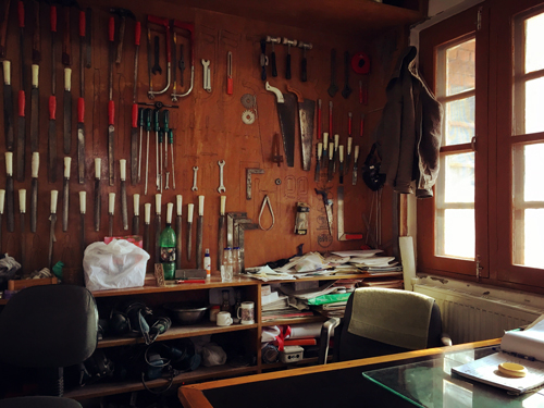
The local Craft Development Institute (CDI) is an important meeting point for several of these artisans to converge – for workshops, talks and even demonstrations. This is the room of the workshop head, Akhtar.

On one of the searches for an alternative wood turner, we encounter this locked workshop. Practically everything the man needs to communicate about his business is on this door. It could be his business card, this picture.


I find doors fascinating. The one in the upper picture is a washroom door at one of the wood turning workshops. The picture immediately above shows off Pinjrakari, the traditional wood lattice work of Kashmir, older versions of which can still be spotted while walking around the streets of old Srinagar. Khatamband is the other variation, though I believe the term is used for ceiling applications.

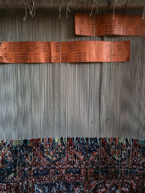

Meanwhile I also sneak into the textile workshops to have a look at whats happening there. New terms and methods find their way into my vocabulary. Often, I am seeing what I have only heard of before. These pictures (above) are from a Kani shawl maker and a carpet weaver’s workshop. As I have learnt from designer Chandrashekhar Bheda who is a textile design mentor in the project, the copper coloured paper sheets in the middle picture (above) are the weaving instruction code for this specific carpet design. The codes are commonly called the ‘Taleem’. I think it also means education. That does make sense.

These spools of coloured thread are from a Sozni and Aari embroidery workshop a short drive away from Srinagar. As a designer I see tints, shades, luminosity and Pantone numbers. It is so difficult to unsee or unlearn these things that I wonder how an embroiderer experiences colour. In that sense, the designer and artisan are never on the same plane.

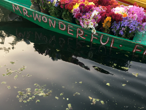

In the September workshop, I was fortunate to be in the company of designer Devika Krishnan, who made a phone call to a friend in Srinagar and arranged a tour of the floating vegetable and flower market on the Dal lake. At 5am we were off in Shikaras (the signature touring boats of Srinagar) to the market (upper picture).

This was followed by a long boat-ride over the Dal to Nigeen Lake where we met the host for this special morning, Yaseen Tuman, who also treated the team to a wonderful breakfast on his houseboat ‘Mascot No.1’. Note the Khatamband ceiling in the picture above.


If all the pictures seem summery and comfortable, the trip In December was not. Though this second workshop was shorter, it was sufficiently long enough to experience the cold, the power cuts and a general December gloom over the city. Work goes on though, and the benefits of a Kangri (the portable hot-coals-in-a-basket solution – see picture above) are immense.

I did finally manage to spend a good amount of time with Iqbal, the Naqqash – the fourth and final craftsperson assigned to me. Since he has already demonstrated his skills with some of my explorations in the September workshop, I am a bit clearer on the opportunities his work presents. In the blue box picture above is one of the effects I aim to expand upon – a technique by which the design pattern is raised. I shall only be providing him with about 60% of the instructions though. The rest will come from him. A contribution that I value greatly in the design of craft objects.

Nearing the end of the second workshop, I realise how little time we have had for visiting popular sites like this wooden architectural wonder of a mosque – The Shah-e-Hamadan. The interiors are donned in extensive papier maché. From a designer’s perspective, it seems disastrous to have a wooden construction of this scale with inflammable interiors too. The repair visible on the topmost portion is damage control after a recent lightning strike. But its over 500 years old. Thats a lot of time. And somewhere we’re so tied to the idea of permanence.
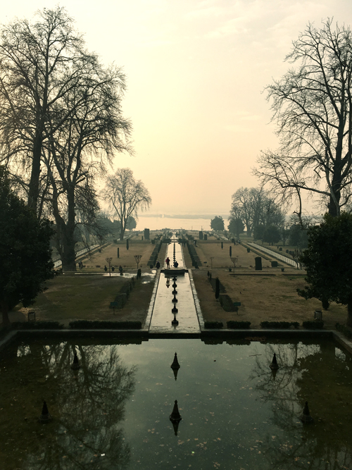

The December workshop is wrapped up with a trip to the Nishat Gardens. I’m told its a better place to see in spring. Of course, but this will do as well. Outside next to the Dal, a boatman brings in his boat as the sun sets.


As an interesting coincidence, I happened to shoot the same portion of the mountain range on both my trips to Srinagar. The first one is in the first week of October, the second is Christmas day.
Hopefully, the next one shall be March.
Thanks to the following for their continued support: Shruti Mittal and Riya Gupta: Commitment to Kashmir / Laila Tyabji, Dastkar / Jatin Bhatt, Pro V-C, AUD / Chandrashekhar Bheda, Textile Designer / Tauseef Rehan Abidi, Studio Saswata, who has been great company at the December workshop / Yasir Mir, CDI / Burhan Khateeb, Industrial Designer / Midhun KM, Industrial Designer / Devika Krishnan, Designer / Gunjan Jain, Textile Designer / Akhtar, CDI.
If you’re a designer interested in participating in the Commitment to Kashmir Design Workshops, please write in to ctok.delhi@gmail.com expressing your interest. All photographs ©Harpreet Padam 2018q
usttad project – bidri craft technique
This post covers Harpreet’s design workshop with traditional Bidri craftspeople at Bidar, Karnataka during June 2017 as part of USTTAD – a project of the Ministry of Minority Affairs, Government of India in partnership with NIFT – National Institute of Fashion Technology.


The topic of Craft in India may be imagined as a musty crumbling library with more librarians than readers and terribly low chances of any new books being added to its shelves. Harsh as this may sound, even after I may be forgiven for my admitted lack of awareness of current developments, this may be the truth.
Earlier this year, I accepted to be part of the USTTAD project on behalf of NIFT Bengaluru, which involved working with one of three selected crafts in the southern Indian state of Karnataka. My opting for Bidri was largely influenced by my total ignorance of the making technique and of the people who practice it. The allure of newness. And of course a sense of optimism towards an opportunity like the one presented.
As designers, I often think we are like trained marksmen, killers on hire. We descend upon our subject in full concentration, educating ourselves in extremely short periods of time about their core behavioural patterns and identifying the optimum modus-operandi to achieve a clear objective. I think it works. Though maybe not in a manner as simple as that.
A typical USTTAD project workshop involves the development of a range of 25 objects within a workshop span of 15 intensive days on location with a group of 15 craftspeople mentored by a single master craftsperson. The objects to be developed should ideally bridge a now reducing gap between the craftsman’s aesthetic and the taste of the urban Indian consumer. This does not, however, permit the visiting designer to shun everything that precedes his or her visit. I think it’s important to remember that even the most traditional of objects was once the most contemporary creation of its time. It is surprisingly quite easy to often overlook this thought. We tend to bundle everything preceding us in a common cabinet labeled history, and lock it up. But this discussion shall go well beyond a small post like this. Moving on.
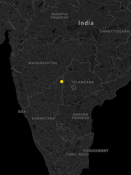
Bidar, the city that lends Bidriware its name, is a small hilltop town in Northern Karnataka. One of many laterite moles on the vast cheek of the Deccan plateau. Due to its location, there is as much Telangana as Maharashtra in its local Kannada flavour. Hindi is spoken everywhere, a blessing for a visiting designer already struggling with four languages.

The closest and possibly fastest connection to Bidar from cities outside Karnataka is via Hyderabad. 2 hours from Delhi, and then 3 or 4 hours via state bus or taxi. The state buses are cheaper and better acclimatisers to the winds that sweep the Deccan Plateau. Taxis are taxis.
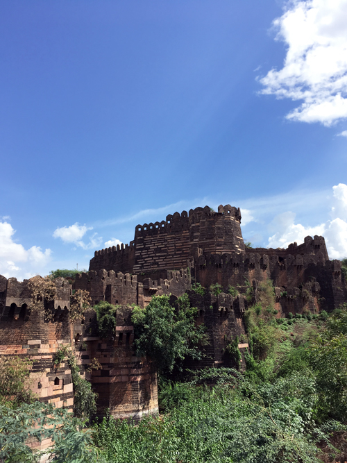
The workshop I’m working with is in the busy old fort area, very close to the easily identifiable ancient tower called the Chowbara. The soil is a burnt red across the city. Its like being in a film with a dominant colour filter. Laterite bricks are everywhere, and so are exposed laterite hills.
On my request, the fifteen day workshop was extended to twenty days. A few extra days to soak in the local-ness. After much necessary paperwork, verification of the participants and even a short speech by me and the coordinating officer from NIFT, I dive right into quickly making as many mistakes with my prototypes as I can. Hopefully, of the 25 objects required, 10 would turn out worthy of further marketability.
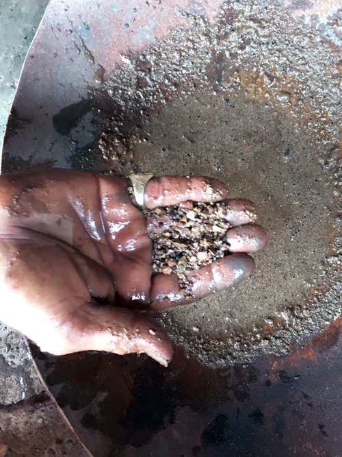
The process of making a typical Bidriware object is not very complex to understand visually. Though on the technical (and chemical) front, things are different. To describe it briefly, Bidri involves the inlay of either silver, copper or brass onto a surface that is an alloy of zinc and copper – which is then oxidised to a deep black, leaving the inlaid metal unaffected in stark contrast.
Expanding into more detail, I divide the process into five main parts. First – the creation of the ‘master’ piece from which other replicas shall be generated. Second – the surface ornamentation and creation of the patterned bed into which the silver (or brass, copper) shall be inlaid. Third – the sand casting of this master to generate the required number of pieces. Four – inlaying the silver. And five – the pre-finishing, oxidation and final finishing of the piece.
In terms of importance, the engraving/chiseling of the patterned bed is a core skill. What pattern shall be engraved is a matter of either personal choice of the artisan, in which case he may consult his heirloom of sheets, photocopies or tracings – or, it could be briefed by the designer or entity who has commissioned the order.
The other important step is the surface oxidation of the zinc alloy, which is how the name Bidri actually comes about. Amongst the craftspeople, the sudden deep matt black oxidation of the previously shiny silvery alloy is attributed to the process of heating the finished object in a mixture composed mainly of soil collected from the shaded ramparts of the Bidar fort. Researchers have probed further on the subject of this particular oxidation due to the local fort soil. The black patination has been studied in detail and the results presented in the paper ‘The Technical Examination of Bidri Ware” by Susan La Niece and Graham Martin, even though the precise cause of the blackening has not been determined.
To explain it visually, the process begins with the selection of the ‘master’ design piece. That is if the object to be produced is one that has been ordered previously. In the case of a new design, the process begins with making this ‘master’ design itself. Local carpentry workshops assist in this case with either turned wood models or shaped wood blocks (using jig saws and sanding belts). In other cases, waste plastic (acrylic) sheets may be cut and joined to produce a rough model. This model is then sand cast once to produce what shall be the ‘master’ design piece. Many such master designs may be seen in this picture of the workshop store above.
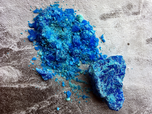
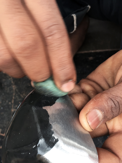
In order to prepare the surface to create an engraving pattern, a small pouch containing moist copper sulphate is quickly dabbed over the surface. Copper sulphate is bright blue in colour, and the dabbing produces a black patination over the surface of the master design. This helps in creating the engraving pattern since it shall be easily visible on the blackened surface.

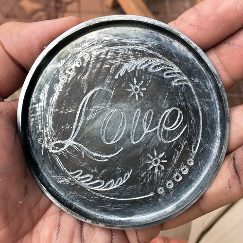
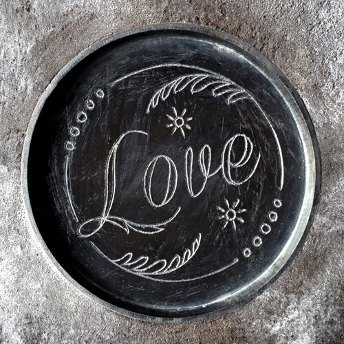
This is a picture of a pattern scratched upon the master design surface, before the engraving begins. In this case, the pattern was requested by me to be drawn by memory.
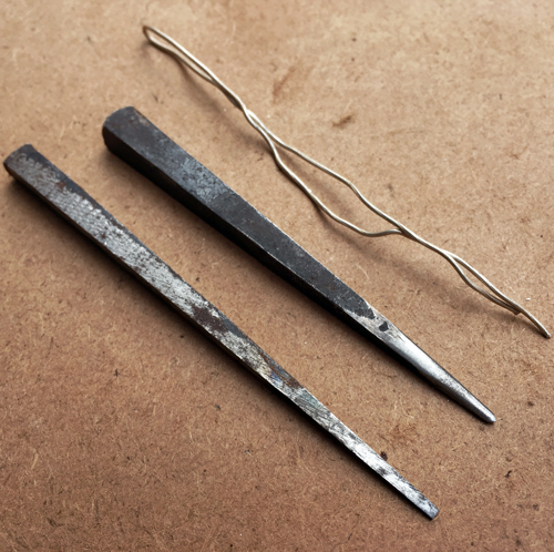


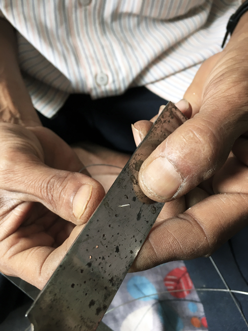
The engraving tools used to create the inlay ‘bed’ for either silver wire or sheet are shown in the pictures above. The interesting part being that these engraving chisels are engineered from old files. Understandably due to the hardness of files. The local blacksmith assists in deriving the rough sizes and shapes, though the final sharpening is done by the craftspeople themselves.

For the inlay of wire (left), only the outline path is engraved. For the inlay of sheet (right), the entire design is chiseled out to create a ‘bed’ that shall accommodate the sheet to be inlaid.

By the time the engraving progresses, the blackened surface of the master design turns a dull grey. This is still sufficient to provide the visual contrast needed for accurate engraving.
Once the engraving is complete, the master design will look like the picture above. A flat chisel has been used to debur the sharp edges produced due to engraving. Once it is sandpapered and cleaned, the master will look like the lower picture, and is ready to be sandcast into replicas.
The materials crucial to sand casting can be seen in the pictures above. In the upper picture, the sandy soil that shall be used to create the sand mould and in the lower picture, molten alloy of zinc and copper (9:1 ratio) that shall be poured into it. For better understanding, the video below should explain it much more clearly. Do excuse my decision to shoot the video in a vertical format.
The sand cast pieces are then filed, brushed, sanded and cleaned to prepare them for the wire inlay (or sheet, depending on the design). In the picture above, the pieces are to be inlaid with silver as well as copper wire.

A variety of tools are used at different stages of the process, though the ones above are the most frequently used. These do not include the buffing wheels which impart the final polish to the finished object.
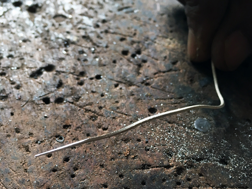
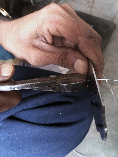

The pictures above show the sequence of wire drawing – thinning down wire to match the engraved channel ‘bed’ that it must be inlaid into. A wire drawing plate helps in this regard, thinning the wire through pulling via sequentially smaller holes.
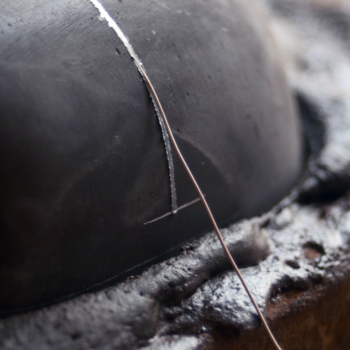
The detail of a silver wire that has been partially inlaid can be seen in the upper picture. In the lower picture, the craftsman is hammering the wire into the desired channel. Silver and copper being softer metals inlay easily. Brass is harder and needs to be hammered a lot harder.

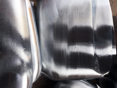
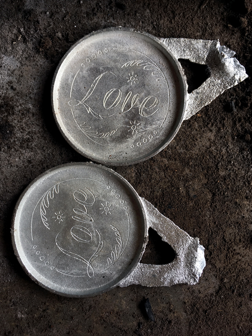
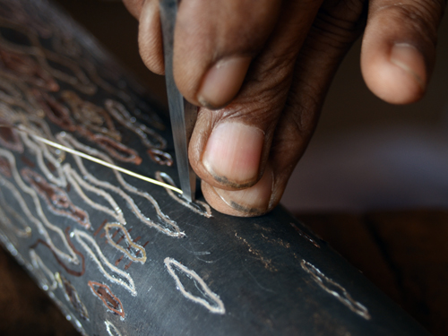
Inlaid wire looks like this. The piece is now ready to undergo the pre-finishing polish, involving hard buffing to smoothen out the surface, and soft buffing to give it a lustre. Once the piece has been polished, it is often hard to distinguish between the inlaid silver wire and the zinc, since they both shine equally well at that stage (see lower picture).

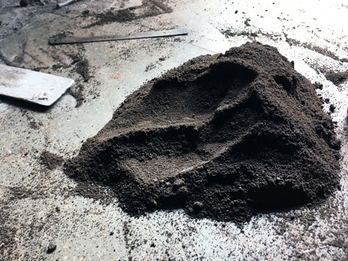
The next stage is by many ways the most crucial – the final oxidation of the object that shall impart upon it a black patina which forms the very identity of the Bidri craft. The soil credited with enabling this black oxidisation is collected from shaded areas of Bidar fort (above). The collector simply tastes it to ensure that it is the right kind. By many ways, this is the core skill passed on from each generation to the next. Taste.
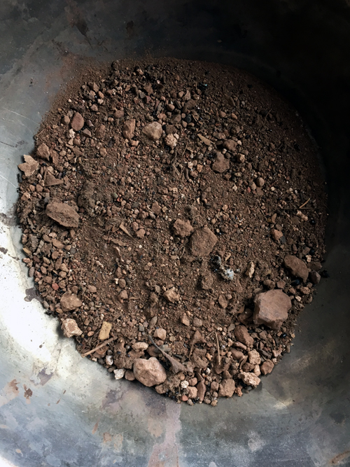
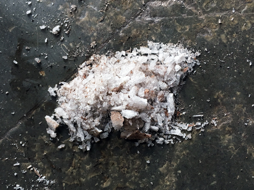
The mud collected from the fort looks like this (upper picture). After basic sieving to remove the larger pebbles, this is mixed with ammonium chloride (middle picture) to form a solution as seen above.

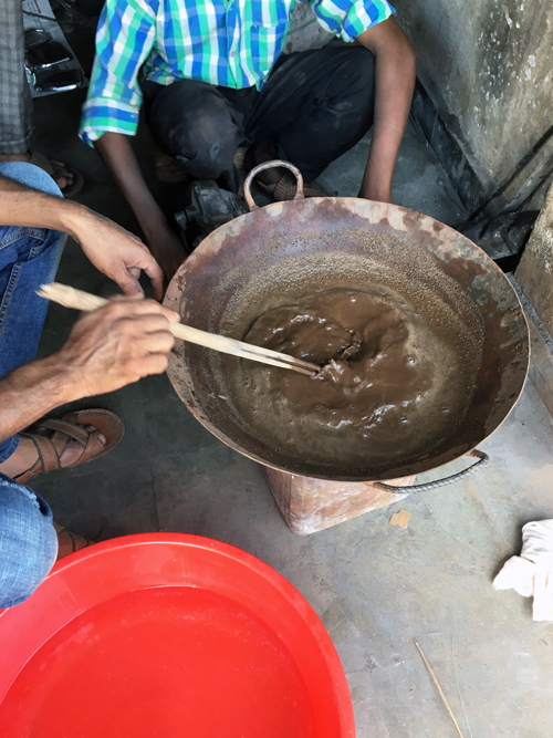
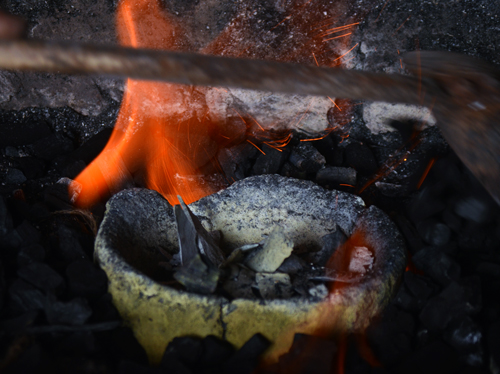
More water is added and the solution is then heated to a boil.
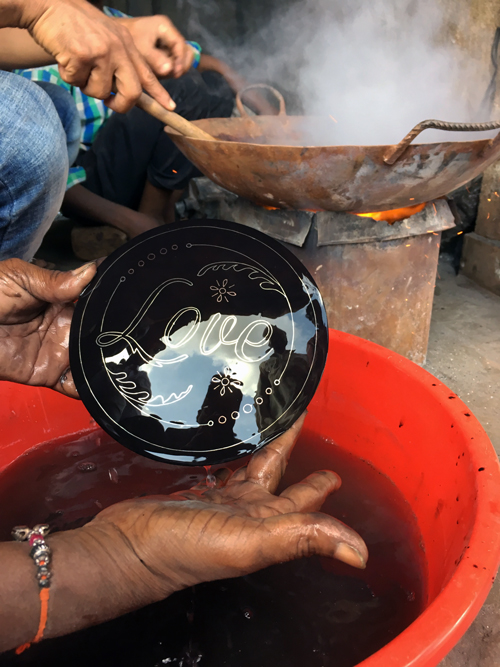
Sequentially, each polished piece is then dipped and throughly stirred in the heating solution. In about 15-20 seconds, each product is given a wash in water and all that was a shiny zinc surface turns a deep matte black. The inlaid metal, be it copper, silver or brass, does not attract the black oxidation. This is the precise moment that the Bidri process lays absolute claim to.
The geographical heritage tag associated to the craft of Bidri rests pretty much on the availability of the ‘magic’ soil from Bidar fort. With the Archaeological Survey of India getting increasingly strict about soil being collected from the fort premises, the craft shall of course look towards substitute oxidants. Already, new research at the IIT Madras has been able to recreate the Bidar fort soil in a laboratory. More such results shall of course define the future of Bidri ware.

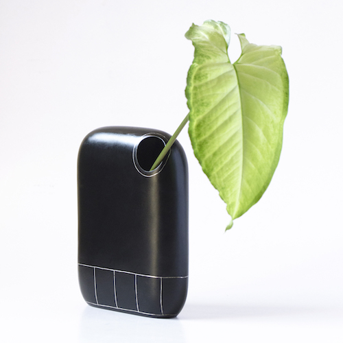
These are finished Bidri coasters, the making of which can be seen in the some of the pictures above. They are inlaid with copper and silver. A set of two can be purchased at our studio webstore: www.towithfrom.com
More products shall be available soon through www.towithfrom.com and other offline and online channels.
Update: NOOK Vase, one of the products designed during the workshop, has received a nomination for the Elle Decor International Design Awards 2017 (EDIDA India) in the Tabletop Category.
Much thanks to the workshop team of 15 artisans at Bidar as well as Yathindra Lakanna, Sanjeev Kumar and Girinath Gopinath of Fashion and Lifestyle Accessory Design Department, NIFT. All Photographs ©Harpreet Padam 2017. Products featured at top of post: 1. PLOY Storage Box / 2. OID Boxes / 3. NOOK Vase
salone satellite: 20 years of new creativity

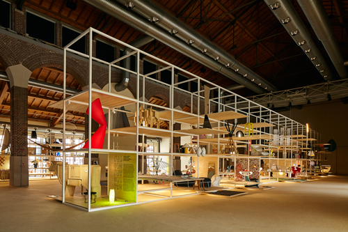
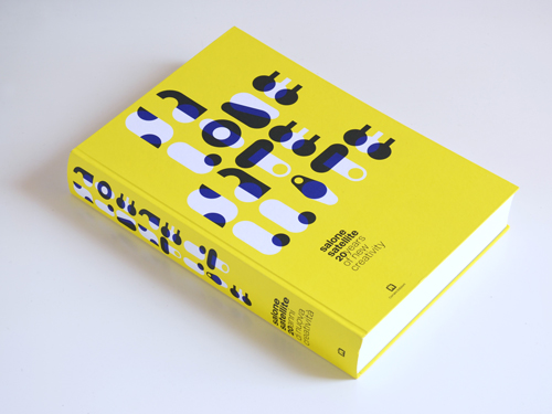
In April 2017, we were part of the mega exhibition Salone Satellite: 20 years of New Creativity at Milan, Italy. The exhibition celebrated 20 years of the young designer’s section of the Salone del Mobile – the Salone Satellite. 500 products curated by the Italian architect Beppe Finessi were exhibited at the Fabbrica del Vapore space during Milan Design Week.
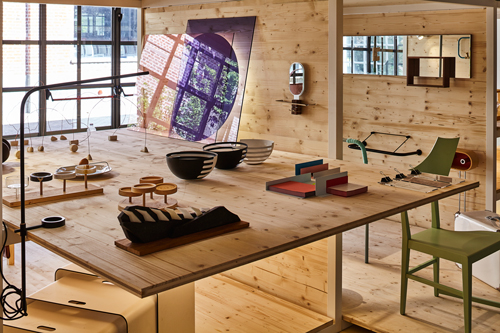
Our product, Kvikk, was displayed in the category ‘Typological Innovation’ alongside work by Marc Newson, Nendo, Matali Crasset, Scholten & Baijings, Satyendra Pakhale and a long list of Satellite alumni.

Besides Kvikk, two other selected products by Unlike Design Co. – Ammo and Slot – were also published in a new book by Corraini Editions.

Also included in the exhibition was Indian design studio Studio Avni, the only other Indian representation.
Many thanks to Marva Griffin Wilshire and the team at Salone Satellite and Salone del Mobile for this wonderful opportunity.
Photo © Andrea Mariani and © Unlike Design Co.
remembering kaplicky

Reading or listening to interviews are a great way of peering into the great minds of design and architecture. Some words and phrases have a habit of sticking around for years if not decades. I found this little gem in The Observer (2002) – an interview with Jan Kaplicky. The name first registered in my mind only upon his sudden passing in 2009. Upto a few years before that, he was a partner at his firm Future Systems – famous for the design of the Marni store, the Media Centre at Lords, the Selfridges Birmingham department store and much more.
In this piece, he speaks in a reassuring and inspiring tone, much like the old Milanese architects who saw no boundaries between buildings and objects – from spoons to cities as one of them said. Personally, I like to believe that categorisation within the creative profession is as fragile an idea as the boundaries of creativity itself. Given the first chance, it shall be broken.
We’re anatomically designed to stretch beyond our immediate footprint. The mind as head and processor stays at a relatively stable centre, but the arms reach out to touch and connect as the legs walk and run exploring new surfaces. Tim Brown of IDEO calls it ‘T-shaped’ skills. Paul Rand did contradict, though I doubt he will in a present day scenario. He said – “a student whose mind is cluttered with matters that have nothing directly to do with design… is a bewildered student.”
That said, here is the interview with Jan Kaplicky:
“The world is full of beautiful things, and you have to be observant as an architect – if not, you are in trouble. Creativity is everywhere. I don’t collect beautiful pieces of design, but I do collect airmail stickers, which I find fascinating: how they differ over the years and the energy that goes into them.
I come into the office every day. I like to arrive at 8am, as this is a very peaceful period when I can think about things before the usual routine starts and other people arrive. The weekends are even better, because there are no distractions.
The initial idea for a job comes to me literally just like that sometimes, and if that first idea is good then you are on the right track. It’s not a sign of creativity to have 65 ideas for one problem, that’s just a waste of energy.
I also don’t think you need to go anywhere particular to be creative; people just use that as an excuse. But I do think a lot of creativity depends on your relationships with other people, your personal relationships, your partner or whatever. Your personal happiness or unhappiness comes out in your work, it’s a reflection of your emotional state and you can’t separate the two.
Architecture is generally presented by one name, but it’s a fantasy and very 19th-century to claim it is a one-man product. A lot depends on the people you have around you and how good they are. There are the structural engineers, environmental engineers, modelmakers, photographers – as well as the guy in Italy who polished the steel for the tower we’re presenting at the Venice Biennale this year – if he doesn’t do a good job, then you have a badly polished piece of steel.
The biggest mistake is underestimating the small product. It doesn’t matter if you’re designing a coffee cup or a 25,000sqm building – the principles of design are the same, it’s just a matter of scale. I think perhaps my favourite creation is the Media Centre. It is something which was revolutionary in many areas – a real technical achievement – but above all, the people operating inside it have said: ‘We love it,’ and that’s great.”
September 22, 2002 / Kate Mikhail / The Observer
Photos: Selfridges Store, Tony Hisgett / Zlin Cutlery for Alessi, Dezeen / Detail from Ferrari Museum, Dezeen.
hiroshima appeals

Came upon this beautiful piece at the Contemporary Japanese Posters exhibition in the city today. The designer of this poster Yusaku Kamekura with illustrator Akira Yokoyama have managed to very successfully capture a feeling of the moment that cannot be described in words alone. In that sense, it is a true poster and a magnificent piece of communication design.
Having visited Hiroshima alters the way you imagine the atomic bomb forever. It links you to the place and the incident that holds such importance in world history. The moment of destruction embeds itself in your memory, and August 6th is no ordinary date anymore. That we were to come upon this poster only a day after US president Obama visited Hiroshima is also interesting.
The exhibition Contemporary Japanese Posters is on at the Japan Foundation, New Delhi from May 13 to June 4, 2016. A second part of the same exhibit opens on June 10th to close on July 1st. Many thanks and wishes to the Japan Foundation for bringing this inspiring collection of posters to New Delhi. Poster Design: Yusaku Kamekura, Illustration by Akira Yokoyama
in elsa’s words
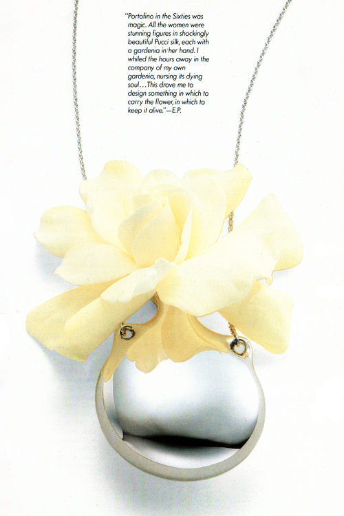
” Portofino in the sixties was magic. All the women were stunning figures in shockingly beautiful Pucci silk, each with a gardenia in her hand. I whiled the hours away in the company of my own gardenia, nursing its dying soul… This drove me to design something in which to carry the flower, in which to keep it alive.” – Elsa Peretti on her Flask Pendant for Tiffany & Co.
Picture from Elsa Peretti / Twenty years with Tiffany / ©Tiffany & Co.
in books we trust
One can read about the history of the National Book Trust on the website and several other government htmls. Like many other organisations and government bodies, the original and often genuine intention at the time of establishment has stayed constant. It’s time that has moved on. Whether this is a consequence of the usual government-body culture or a deliberate intention, it is by both perspectives a nice thing.
At Unlike, we have a special interest in the children’s titles – the ones that speak of an innocent India – where children wake up at the crack of dawn and don eager smiles as they get ready for a beautiful sunny day at school. The father drives a scooter and the mother packs everyone off before sitting down to knit or chop green mangoes for the yearly pickling. Parents seldom quarrel and old clothes can still be exchanged for steel vessels via loud travelling saleswomen.
As much as it is about an erstwhile era, it is also about an alternate India that still exists in majority and is a bit removed from the culture of her large cities. In a nostalgic few minutes that it takes to read a story, readers like us whose childhoods have been immersed in the modest and frugal eighties can look back and remember the good times.
In Japanese culture, there is a word that somehow encapsulates the subject, characters and nature of these children’s stories – Ninjô: translated roughly as “the heart or feelings common to man; human affections; humanity; kindness”.
It will be interesting to see how the National Book Trust manages to generate contemporary content while retaining this inherent goodness – which continues to be a relevant and craving need in these modern times.
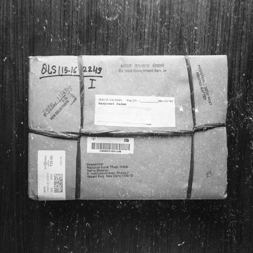
National Book Trust publications can be ordered here.
—
Illustration by Shaival Chatterjee / Text on Ninjô reference: The Circle of On, Giri and Ninjo – Sociologist’s Point of View – Kiyohide SEKI, Hokkaido University, Sapporo, Japan (Hokkaido University Library)
unlike design co. for godrej design lab

For the past few months, we have been working to develop a new design prototype with Godrej Design Lab and Elle Decor. The lab is an initiative by Navroze Godrej of Godrej & Boyce to promote and support Indian design and designers. Unlike Design Co. were amongst eight designers and studios selected to be part of the first edition of this very welcome initiative by a proudly Indian consumer product giant.


Our product proposal with the lab began with a wall utility unit designed for speedy urban lifestyles. Placed next to the main door of the apartment, the idea was to provide the functions of a mirror, shelf and hooks, all installed by the user without much effort. In close collaboration with the team at Godrej, this idea has now further developed into KVIKK – a versatile wall system offering further flexibility and enjoyment for the user.


This week, the prototype developed as a result of this process was presented at the India Design ID 2015 – an annual design event dedicated to interior and space design. The response has been more than enthusiastic from potential consumers, architects, interior designers and retailers.
More details to follow as the lab continues to gains momentum. In the meantime, stay updated at: www.godrejdesignlab.com
Photographs © Vikas Dutt Photography / © Zero9 / © Unlike Design Co. / Video © Godrej Design Lab
–
The TV series CNBC Young Turks recently covered the Godrej Design Lab as a unique initiative by Navroze Godrej. Watch the video here.
new products in the shop
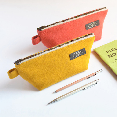
Our TOWITHFROM webshop has received a new stock of products – this above is a set of Toss soft cases, available in three vibrant colour combinations. Order at this link. It might also be a good idea to follow the TWF Instagram feed and Facebook page to be the first to know of the special stuff (you know what that means).
Photograph © Unlike Design Co. / TOWITHFROM
a design workshop at boisbuchet
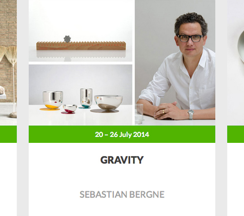
Four wednesdays ago, I jumped at the opportunity to attend Sebastian Bergne’s summer workshop ‘Gravity’ at the Domaine de Boisbuchet in France. Sebastian has been a favourite ever since we came across his work some years ago and the chance to attend his workshop and interact closely with him was too good to let go off. To add to that, Boisbuchet has existed on that hazy big list in the mind since 1998 when I first saw the poster at design school.
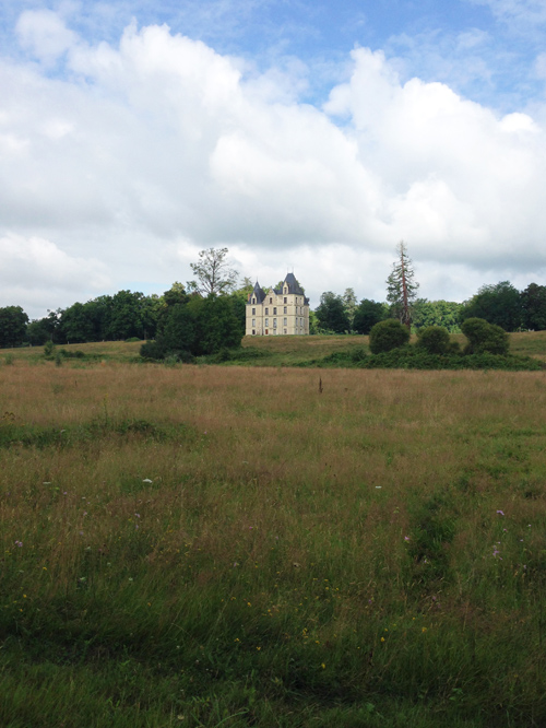
So here I am. The location of the workshop, Domaine de Boisbuchet, is a sprawling estate in the French countryside with mentions of its existence in documents from as early as the 16th century. Alexander von Vegesack, founding director of the Vitra Design Museum, purchased the site in 1986. For the past two decades, the estate has been host to summer workshop programmes attended by design students & professionals from across the world and tutored by acclaimed designers and architects. The chateau in the picture above is it’s visual ambassador, the symbolic heart of the Domaine de Boisbuchet.
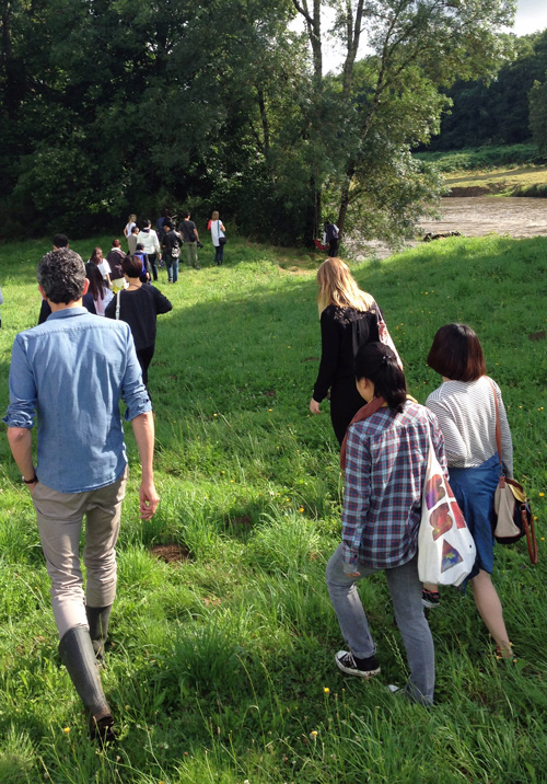
Day 1 at the workshop begins with a tour of the estate. It’s called an architectural tour because the enormous landscape is dotted with structures, installations and buildings that have been designed and built by renowned architects, either on invitation, or as part of the workshops.

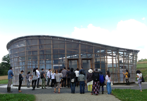
Shigeru Ban, this year’s Pritzker Prize winner, built his first permanent paper building in Europe on the gardens of the Domaine. This is the structure – the Paper Pavilion, made primarily of recycled paper tubes and constructed together with 24 students in 2001.
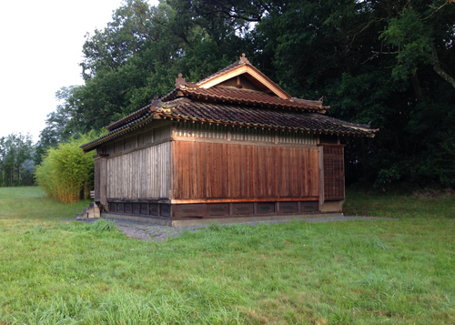
The Japanese Guesthouse cannot escape the eye, standing on the large sloping grounds leading to the river Vienne which runs through the campus. A gift from the Japanese people, the guesthouse dating back to 1860 was dismantled and brought to Boisbuchet to be reassembled on site by Japanese craftspeople.
I particularly like the joints and details of this domed structure by the architect and engineer Jörg Schlaich, who co-developed the Munich Olympic stadium back in the day. It does not take long to realise that we are witnessing some really great pieces of work by passionate and dedicated architects.
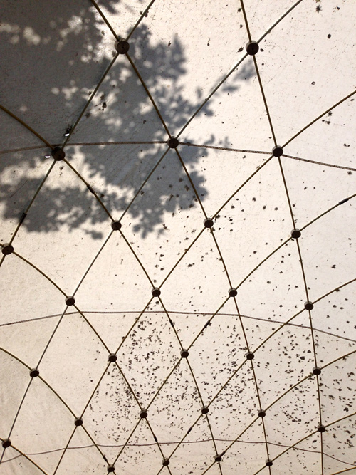
The tour ends with viewing an exhibition about the Domaine at the Chinese Pavilion, a bamboo structure by the German architect Markus Heinsdorff. We learn more of the estate’s history and of the thought and making process behind the various projects that we have seen across the site.

And then it’s down to business – meeting and discussing the workshop theme with the other participants and of course Sebastian, who has chosen ‘Gravity’ as the theme for the work that we shall do. We are five people in the Gravity workshop – Chris, Sam and Kenting from Taiwan, Nico from Italy and me, from India. There is another workshop being held simultaneously and the mentor is Andrea Trimarchi from the Netherlands studio Formafantasma. As the week begins, it’s exciting to anticipate the numerous upcoming interactions within and across groups. Work, people, ideas and a place to match.


Over the next few days, as a group and as individuals, we explore the workshop theme through models, experiments, trials and numerous errors. The process is fun and Sebastian is an equal and encouraging participant in the successes and failures. It is exciting – especially not knowing what shall happen when it is finally time for everyone to present their work at the end of the week.
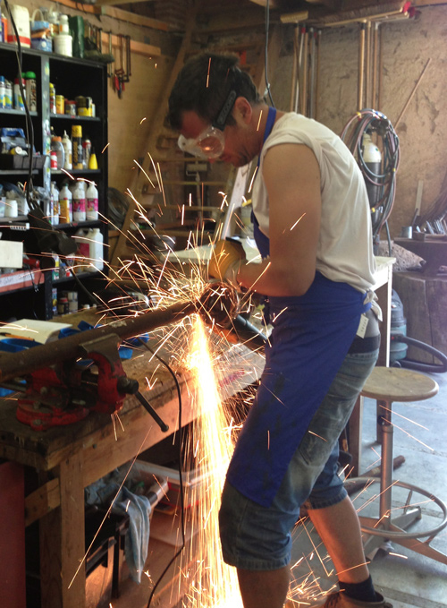
At our disposal is a massive workshop space, equipped with raw material and basic machinery for metal and woodworking. It is managed by three very skilled and energetic guys who have probably never said no to making or trying out anything new. Coupled with the vast natural resources and found materials on location, the combination is magic.

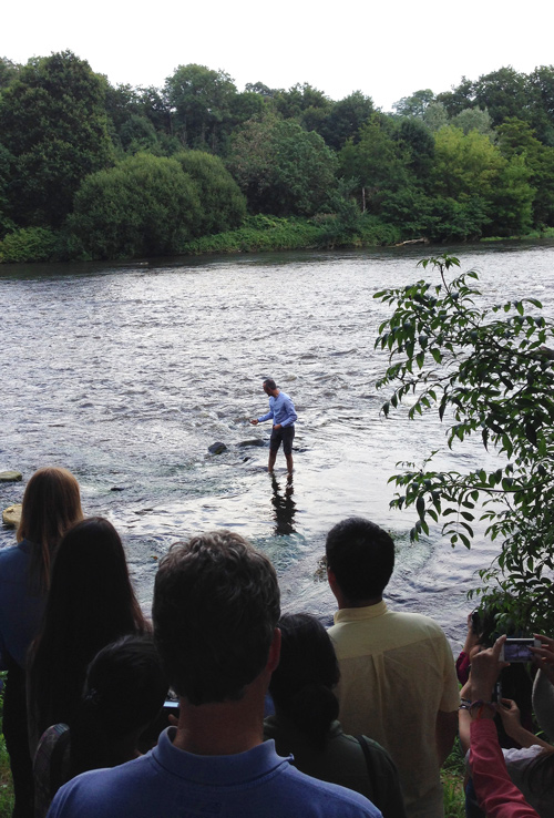
The woods, the river and lake, the rolling grasslands, the rocks and the earth, the plants and trees, mosses and mushrooms – all offer as much a calming sanctuary for ideas as for the material they present, urging to be transformed into objects and experiments by eager minds and hands.


As much as the members of my group are exploring gravity, the other group participants are discovering and creating new natural materials and processes. By the time it is Thursday, the workshop area and surroundings are busy with activity. There is a mess of material and chaos of kinds, but the design process is very much like that, and to those that immerse themselves into it, it is a beautiful experience.

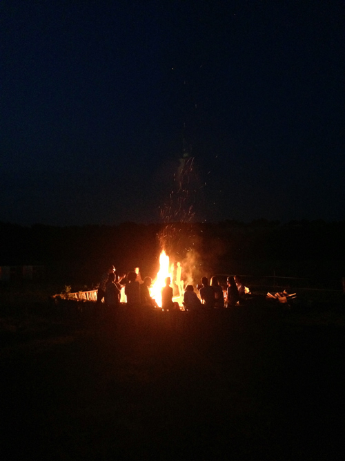
Despite the quantum of work, it’s nice to take some time off to count the clouds, canoe in the lake or sit by the bonfire.
On Friday, after the usual coffee break at half past four, the presentations begin. As the entire group moves from project to project, the participants speak about and present what they have been doing through the week. It is an enjoyable privilege for a designer to be introduced to the methods and processes of another designer. Consumers and end users do not often get to hear of the stories and design process behind the objects they desire to purchase, possess and use.
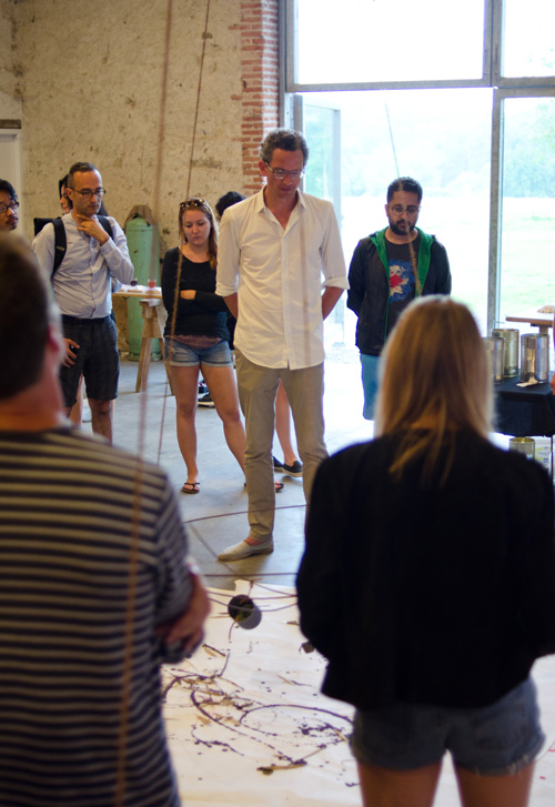
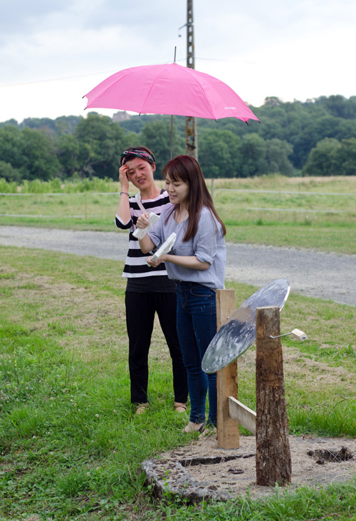
Sebastian speaks about our first group exercise together where we played with a can of paint left to the pendulous freedom of gravity. The artistic results of the process have been spectacular and surprising. Simple thoughts when pursued and coaxed often reciprocate with astonishing outcomes.
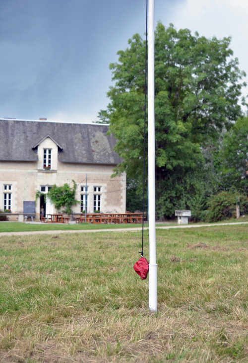

For my own project, the idea was to explore the otherwise usual effect of gravity and interrupt it with a secondary force, in this case the circular motion experienced by the rock due to its relationship with the pole and the cord connecting the two. The user/participant swings the rock freely into the air, setting forth a circular motion that makes the connector cord wind and unwind around the pole several times before coming to rest. The process usually lasts between two to three minutes, offering a kind of slow and calming form of entertainment for the participant. I call it ‘Two Masters’. Here is a video clip of it at work.
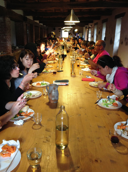

At dinner that evening, conversations turn into email exchanges and promises of staying in touch. Amidst it all, somebody turns on the music and a party begins. Tomorrow, it’s back to Paris and the flight back home. But that’s tomorrow.
–
A full calendar of workshops for the year can be seen at the Boisbuchet website. You can also register and pay online for a workshop. Domaine de Boisbuchet is easily accessible via train from Paris (to Poitiers station, where a paid bus picks up participants every Sunday evening). Accommodation and dining is included in the workshop fee. For any details not found on the website, feel free to write to me at harpreet (at) unlike (dot) in
All photographs © Unlike Design Co. and © Lucia Peluffo / Domaine de Boisbuchet

2 comments